City and light: Symposium
The project I will present today is part of the city of Arnsberg but not an immediate part of its urban space. We find a place that is extraterritorial and self-sufficient. It is about the redesign of a former monastery. Its qualities are only possible through demarcation and the creation of its own world with its own conditions, outside the urban context. This makes it somewhat difficult to talk about city and light. The approach to the topic is different. During the preparation I also noticed that the references and thematic references are inevitably more classical than those of urban space.
History of the monastery
We have been working intensively on Kloster Wedinghausen since 2002, i.e. the last 5 years. During this time we have redesigned 3 different parts of the monastery. The revitalization of the monastery began with the conversion of the west wing into a town and country archive and the design of a permanent exhibition on the cloister level. It was completed in September 2006 with the redesign of the monastery courtyard. Let me first describe the place I found.
Alt Arnsberg is characterized by a history of almost 1000 years, favored by its prominent location in a Ruhr loop. The town has developed in the spatial tension between castle and monastery. The monastery has always been outside the city during its active time and only became part of the old town of Arnsberg in the 19th century during the secularization through a classicistic city expansion.
Arnsberg has always been an important location for state and church. Before there was ruled. The importance of the monastery was therefore never only regional.
Kloster Wedinghausen was founded in 1170 as a Premonstratensian monastery after the fratricide of Count Heinrich I as a convent of expiation and was continuously rebuilt and expanded. The monastery had its heyday around 1700 in the baroque era, when the monastery underwent major expansions.
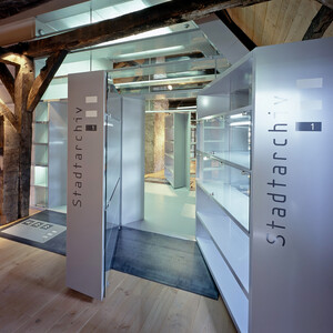
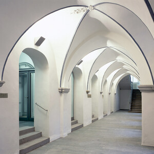
In terms of building history, the monastery has never been a homogeneous place, but rather a journey through the history of style. The monastery has Romanesque, Gothic, and Baroque Classicist elements. However, it does not have elements of architectural history. The baroque suspended structure of the roof truss in the west wing is perhaps to be highlighted. There our office established the public area of the town and country archives.
It is rather the events and the history of the monastery that lead beyond the regional. The monastery had an important scriptorium and a large library, of which only a small part is preserved in its original state. For example, the monastery had one of the few Koran translations of the Middle Ages. The Gero Codex today Unesco World Heritage Site was at times part of the Arnsberg monastery library, which has just been scientifically restored.
The most important event in Wedinghausen Monastery was the rescue of the Cologne Cathedral treasure in the Napoleonic war turmoil by placing it in the monastery. The Cologne Cathedral Chapter fled in 1794 with the shrine and the important relics of the Magi, the Cathedral Treasury, the Cathedral Library and the Cathedral Archives to Arnsberg, where they remained until 1803. In Wedinghausen Monastery, the important treasures were safe from the grip of the Napoleonic troops.
Significance of light in the Christian faith
Light played an important role in the concept for the redesign of the monastery courtyard. City light, however, poses different conditions than monastery light. The question of light must be approached from a different direction. In any case, the context of urban space was not important for light as a starting point. We must first deal with the Christian iconography of light.
Afterwards I will present the project and the conceptual approach to light, transparency and communication.
Light is an essential element in church construction. It is not used atmospherically, but it represents contents in order to make faith vivid.
Light is equal to the presence of God - darkness is the absence. Light is life. The symbolism of the descent of light is connected with the experience of the ultimate truth, an enlightenment and special knowledge. Blinding light is a sign of supreme divinity and holiness. I quote:
The creation Genesis 1.1
1 In the beginning God created heaven and earth. 2 And the earth was desolate and empty, and darkness was upon the face of the deep; and the Spirit of God floated upon the waters. 3 And God said, Let there be light. And there was light. 4 And God saw that the light was good. And God separated the light from the darkness 5 And called the light day, and the darkness night. And the evening and the morning became the first day.
Halo
In Christian pictorial art, too, light in the form of the halo of rays is an important part of the representation. Thus the “nimbus”, the halo in Christian pictorial art is a symbol for the enlightened or holy, which first appeared in depictions of Jesus, only to be assigned to the angels, later to Mary and finally to the saints.
The circumference of the halo diminished over time, becoming a circular disc or a luminous ring, which was located behind or above the figure’s head. Persons still alive were at times represented with angular halos.
Candle, Lamp/Candleholder
If one goes from natural light to artificial light, the candle as a precursor of the lamp is an attribute of the saints. The candlestick on altars stands for the Divine Presence. The seven-armed candlestick is a symbol of the seven gifts of the Holy Spirit: wisdom, mind/insight, counsel, strength, knowledge, piety and fear of God.
Significance of light in church buildings
The most important theological passage for Christianity regarding light is John 8:12.
John 8:12 I am the light of the world. Whoever follows me will not walk in darkness, but will have the light of life.
The light aesthetics/light architecture of Christian architecture has developed on the basis of the equation of God’s light described in the Gospel of John. The gothic architecture of the 12th century embodies the heavenly Jerusalem on earth through light. The dissolution of the wall has the goal of placing light at the center of the architecture. I will come back to this in more detail later, when I discuss the concept of “diaphanous space”, the project title.
The entire history of church construction is an architecture of light. In the baroque era, the wall was closed again - but the theme of light was still dominant. It was only staged in a more concentrated way.
Project Location
The Christian iconography of light is a premise. In the following I will go into the project in more detail.
After the dissolution of the monastery at the beginning of the 19th century, large parts of the old monastery complex were demolished. The property was brought to Darmstadt after an exact inventory. At the end of the 19th century, the monastery and its historical rooms were no longer recognizable as such. Before the redesign, the monastery courtyard had been turned into an asphalt parking lot. Arnsbergers no longer knew the place as Kloster Wedinghausen.
Description which parts were demolished. Demolition of the northern cloister after secularization in 1803, southern wing was demolished in 1886 and the western wing was sold to the city
Concept
However, the demolition was not only a loss, but a departure into the modern age. The opening of the monastery courtyard through the demolition of the south wing was an expression of a social process and a spatial enlightenment, which for us also brought a new quality to the place: light, depth and orientation towards the natural space.
The historical courtyard space was unfocused; its symmetry emphasized the equal value of the sides. The existing space of the 19th century, however, was linear. The new design combines the historical contradictions of demarcation and opening. The different spatial directions were to be brought together. This corresponds to the working method of our office, not to exclude opposites against each other, but rather to regard them as enrichment and bring them together in dialogue. Both and is always better for us than either or.
With the redesign of Kloster Wedinghausen we wanted to make the spatial breaks of the monastery visible and at the same time restore a common architectural space for its sacral and secular functions. The redesign of the monastery courtyard consists of 3 parts: the monastery courtyard, the light house of a kind of filter room and a garden, which is actually part of the building.
The light house
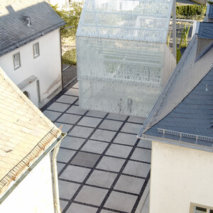
The light house stands on the site of the demolished south wing and marks the boundary of the historic monastery courtyard. Its form refers to the surrounding gabled roof houses. We did not want a formal foreign body.
The visitor experiences a boundary through the location of the building and at the same time a linear sequence of rooms through the glass façade, which transfers from the inner world of the monastery to the outer world of landscape and nature, allowing light and spatial depth to be experienced. For us, Kloster Wedinghausen is a spatialized metaphor for the departure of history into the new.
The light house creates an ambivalent spatial feeling for the monastery courtyard:
- It is treated as an interior space and is ultimately a room without a roof.
- At the same time, the monastery courtyard is inconceivable without the depth of the room and the constantly present outside space.
In order to clarify the transition to the exterior space, a dissolution of the spatial body on its back takes place - a metamorphosis of space from architecture to nature.
Due to the spanning rope construction, the garden is quasi part of the building.
Garden Room
We have called this part Garden Room. The Garden Room refers to the former monastery garden and the nearby forest. Its green and lively space contrasts with the clarity and austerity of the introverted monastery courtyard. As the hanging planting continues to grow, even beyond the light house, the border between architecture and garden disappears and an ambiguous space emerges.
The monastery courtyard
The monastery courtyard is a place of peace. We have therefore purified the space and given it a clear symmetrical orientation. The existing arbitrary, non-axial accesses to the wings of the courtyard could not be changed. However, they were symmetrically integrated by new access ramps.
Symmetry always has a suggestive effect, which helps in the search for spatial understanding. The body finds its counterpart in symmetrical space. Meisenheimer speaks of “reflection of the body’s scheme and emphasizes the connection between spatial symmetry and the sense of balance”.
The strict rhythm of the flooring creates awareness for appropriate movement in space. The movement is slowed down by the joint and through it one is invited to experience human and architectural dimensions in harmony. The artist Carl Andre has shown the importance of the floor for movement in space and its perception.
Light
In the following I would like to point out the importance and the connection of light, spatial layering, transparency and communication in space for the project.
I will talk about light in general and deliberately blur the boundaries between artificial and daylight, while being aware of their differences.
Diaphane Room Cathedrals Hans Jantzen
The title of the project is “Diaphanous Space”. The term is taken from a theoretical writing of the art historian Hans Jantzen about Gothic cathedrals. (About the Gothic of the Occident).
Most theories explain the Gothic sacred space via the vault (Sedlmayer). The Gothic becomes a constructive question describing the miracle of technical achievement - Gothic is verticalization through the ribbed vaulting. It is a framework of cross ribs, pointed arches, buttresses and the main question is the degree of breaking through and dissolving the wall.
Wall
Although Hans Jantzen’s theory emphasizes the importance of the dissolution of the wall, it shows that the Romanesque period was already familiar with it and that even with the greatest possible dissolution, the continuity of the wall and a coherent wall mass are still in the foreground. Resolution in the Romanesque period is a contrast between closed and open wall sections. The wall in the Gothic period, however, is the ratio of dissolved wall to room parts behind it. It is a relationship of body and ground. The gothic wall is not conceivable without a room ground and only receives its effect through this.
- Background
It is, and this is the decisive factor, backed up by an optical zone. The entire central nave is surrounded by a space shell of different depth layers. The principle of a double shell dominates. This is what Hans Jantzen calls the diaphanous structure of the Gothic.
Goal
The aim is to create a spiritualized space in which the translucence and immaterial glow of the glass windows constitute the essence of architecture. The light background of the room takes away the impression of the materially solid and closed off. The principle of light, transparency and depth layering stages the presence of another place that is not present at the actual location. Gothic architecture is the transition to an imaginable spiritual background. Real and fictional space become blurred.
Quote:
“If we imagine the spatial boundary of the cathedral’s nave as a whole, we have a lattice wall structured like a plastic relief, which is underlaid with an optical dark background or colored light background in various depth layers, relieves the stone of its weight through verticalization and supernatural light, and with its peculiarity determining the spatial whole is capable of pulling people up directly from their perceptible natural environment into the experience of a transcendent worldliness.
Light Diaphane Room Wedinghausen
What interested me in Hans Jantzen’s theory was the architectural possibilities for the project through the connection between depth and light, the resulting dissolution of concrete spatial boundaries and the apparent presence of other places in the concrete location.
The incidence of light and its text shadow on the monastery courtyard are the actual sensations of the project. The light emphasizes the spiritual character of the monastery courtyard as a central theme.
The light is guided through several layers (garden room, light house and facade) until it falls into the interior. The light house and its façade are a luminous body for the monastery courtyard. The entire façade is illuminated. The light and the new spatial boundary of the façade create a concrete interior space, but the background and the depth transcend it again. This creates an ambiguous spatial effect
The theme of stratification and depth of space can be felt in both daylight and artificial light.
At night, we used artificial light to highlight the different subspaces of the monastery’s exterior:
- the monastery courtyard is illuminated solely by the surrounding facades. The façade lanterns were partially taken over. The light in the monastery courtyard is rather restrained
- the light house itself becomes a luminous body as during the day
- the garden is illuminated by spot and vertical light. Instead of surface, the space is emphasized linearly or punctiformly.
Light and transparency
The lighting effect is only made possible by the connection between transparency and light.
The prerequisite is the use of glass as a building material. The material development in the field of glass does not only mean a technological progress but also the chance to expand the spatial effect. Ever since Colin Rowe and Robert Slutzky’s architectural theory classic on transparency, it has been clear that it is not just a matter of looking through. Total transparency, just like a striking view, triggers boredom - we see everything without really noticing anything. Colin Rowe and Robert Slutzky link transparency to the topic of layering and show how this makes the effect on our perception more complex.
Layering, however, does not simply create spaces that lie one behind the other. The building material glass and its reflections and its printing mix the different levels and create a temporal and spatial simultaneity of the levels through confusing overlays. These are intermixed in the dialogue between foreground and background, space and surface. Walter Benjamin speaks in this context of a transparency of penetration and overlapping in which the meaning of things oscillate and merge into one another. One and several pictures exist at the same time.
Light, space and communication
Another instrument is the writing on the facade. Today we understand signs and graphics as an enriching, contemporary medium to structure space where this is not possible or difficult to achieve with architectural centers. Graphics can help where architecture no longer has a chance.
The invisible building material glass is printed and thus made visible. The printing is an informative veil and serves to convey content. Here the glass does not simply want to allow clarity and pure transparency, but rather to create an ambiguity and complexity of information.
The white veil of the façade, produced by screen printing, and the luminous hand-painted panes of medieval church windows create related atmospheres. It is a further development of traditional forms of representation, created in the field of tension between history and modernity.
Writing and text underline the spiritual significance of the place. It is the beginning of the gospel of John. The content is not directly recognizable here, but rather a mystery, which is meant to invite us to decipher it.
John 1, 1-8
In the beginning was the Word, and the Word was with God, and God was the Word. 2 The same was in the beginning with God. 3 All things are made by the same, and without the same nothing is made that is made. 4 In him was life, and life was the light of men. And the light shines in the darkness, and the darkness hath not taken hold of it.
The principle of printing on the façade, serves to bring the historical wings of the monastery, which have been separated in the course of time, back into connection with the rhythm of the graphics. Formal, architectural references could not be established through the various existing openings, however; rectangular windows and round arches have too few similarities for this. The new façade, however, establishes a horizontal reference to the surrounding historical façades and their brightness contrasts between wall and window surfaces through text compression and dissolution.
The text is not only used for information, but also as a kind of structure and relief substitute, making the depth and background vivid.
Interior
The proportions of the building are taken from the surrounding monastery buildings. The reference size of the lower interior is the human scale. The event of the interior is its view upwards to the sky and another space that will be green in the near future. In order to maximize the poetic effect, we have dissolved the roof. All details should be subordinated to the spatial effect. We didn’t want high-tech architecture, although the construction we developed with Schlaich Bergermann und Partner goes to the limit here. Our actual goal was to dissolve the border between architecture and garden. Therefore the details disappear optically in favor of the space.
Luminaires are not the actual subject, they have a serving function. Linear luminaires are recessed into the beams and not mounted on top of them. The beams could be extremely minimized by pretensioning. At night a kind of light staircase is created. Only the spotlights were placed between the linear luminaires on power rails for spot illumination and emerge.
End
With the redesign of Kloster Wedinghausen we have reacted to the special morphological and historical requirements of the place. However, the use of light is different for each project because the conditions are different. However, the importance of light for our living space is constantly increasing due to the shift in our time/activity patterns and the dissolution of rigid life patterns. Light is the perfect medium for architecture - it is useful and emotional at the same time.
