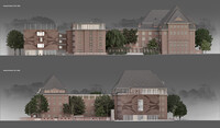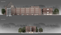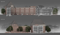


Studio House - Extension for the HFBK Hamburg
Old and new. The historic building by Fritz Schumacher is the starting point and reference for the design of the new. The formal positions of the new building, such as proportion, order, facade and roof edge, are based on the shape and details of the old building. They are further developed and interpreted in a contemporary way. The aim is to build a new, authentic building whose confident gestures are always in dialogue with the existing building.
A college. All rooms and areas of the university are part of the whole. The spatial and organizational context of studios, workshops, administration, auditorium and cafeteria should not be cut up. Instead of being divided into two parts, the design offers a functional space continuum from one end to the other. While the gallery and indirectly the studio levels on the ground floor are also accessed from the urban space, the studios are to be part of the overall organism of the University of Fine Arts. They are connected directly to the existing building and can be reached directly from all floors of the old building. A sensitive transition guarantees the unity of all parts and makes everyday life in the building easier. The connection is not only intended on one side towards the old building. The integration of special uses that do not exist in the old building in the new building represent, from the perspective of the old building, common and attractive goals that need to be achieved quickly. These are common areas in the corridors and the outside gallery on the roof.
Connection. The connecting building, which connects the new building to the stairwell of the historic building, makes the old building functional. It is statically suspended from the ceilings of the new building and is therefore not supported on the walls of the old building. The direct transition is made through the large stairwell window into the stairwell without changing the existing structure in a constructive or structural way. Two independent systems are connected with almost no contact. Old and new are clearly separated with the help of a narrow joint made of glass and, in accordance with the Venice Charter, can be resolved visually and in fact. The connection of the new building to the old building enables space and cost-saving joint use of existing functions that can be renovated in one go. The new building consistently uses the obvious functions. The existing staircase becomes the second escape route for the new building. The toilets in the old building are also used. Disabled toilets are planned in the new building. The area of the new building is enlarged by the connection to the existing building in favor of the studios. The elimination of an escape staircase and some toilet facilities means that the connection is cost-neutral.
Facade. The brick facade, the expressive shell of the old building, will of course be continued in the new building. On closer inspection, the old brick facade does not have a uniform color. The rifts in his biography due to war damage and the renovations and additions can be read from the multitude of different colors. The new facade does not want to level these fractures, but accepts them as historical reality and the starting point for modern design principles according to the heritage conservation reading. While the basic color tone deliberately flows from old building to new building and shapes it visually, the different brick color values of the old building additions and repairs are used to create modern reference images of the old building. The large-scale pattern woven into the new facade is taken from a Schumacher ornament on the old building facade and was further developed using parametric methods. The scaled and abstracted pattern is created by taking over the many different brick colors of the existing building, which the new pattern uses. It is placed as a ribbon around the new building and is given a special drama due to the corner symmetry. Depending on the point of view, the pattern stands for itself or unquestionably for its reference. Elsewhere, too, outside and inside, it is conceivable to further develop the ornaments of the old building parametrically and use them in the design.
Exterior gallery roof. In terms of design, the roof level is a kind of modern twin and a reference in terms of monument preservation to the opposite roof structure of the old building. However, it repeats the existing topic formally in a more open manner, without having to create a roof or a specific room. The new roof is the outdoor alternative to the gallery on the ground floor and shows certain parallels. The university and the students are given a space on the roof that offers the opportunity for self-determined use and appropriate adaptation in the outdoor space. If the new building deprives the students of the building they have built on their own initiative, they will receive a formally and functionally definable space on the roof for appropriation. This freely playable platform